Designer Stacked: A Playful Display Font That Holds Its Own in Real Campaigns
It was 3 p.m. on a Tuesday—two days before the launch of a summer-themed online course series—and I was tweaking the final Instagram carousel post. The headline needed to pop, not just in the feed but *in motion*: quick-scrolling, thumb-stopping, mood-setting. I’d already cycled through three clean sans serifs and two elegant serifs. Nothing landed quite right—not with the tone we wanted: warm, approachable, intentionally unpolished, but never sloppy. Then I opened Designer Stacked. Within 90 seconds, the first slide was locked in. That’s how fast it worked—not as decoration, but as intention made visible.
A Typeface That Speaks Before You Read It
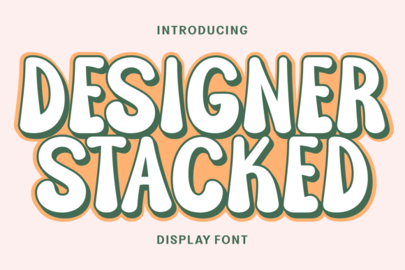
Designer Stacked is a display font built for moments where personality matters more than precision. Visually, it’s a clever stack of uneven, slightly rounded letterforms—like hand-cut paper letters arranged with care, then digitized with quiet confidence. There’s child-like charm in its irregular baselines and soft corners, but also professional poise in its consistent spacing, balanced weight distribution, and subtle optical corrections. It doesn’t shout “fun!”—it invites curiosity. It feels handmade without sacrificing legibility at scale, and structured without feeling rigid.
In practice, that duality shines in campaign contexts where tone is half the message: a Pinterest pin announcing a “Back-to-School Creative Kit,” a YouTube thumbnail teasing a lighthearted design tutorial, or a Reels cover for a small business owner sharing “5 Things I Wish I Knew Before Launching.” It sets the emotional temperature before a single word is processed.
Where It Performs Best (and Where to Pause)
Designer Stacked thrives in short-form, high-impact roles:
- Instagram story headers and Reels covers, especially over muted backgrounds or soft gradients—its stacked rhythm creates instant visual rhythm;
- YouTube thumbnails with tight text space (e.g., “FREE Workshop Inside!”), where its vertical presence draws the eye faster than horizontal-only fonts;
- Email banners and landing page hero headers, particularly for creative services, digital products, or lifestyle brands aiming for warmth over formality;
- Pinterest pins with quote overlays (“Start Small. Stack Up.”), where its playful structure reinforces the metaphor;
- Digital ad headlines for audience segments responding to authenticity—think indie makers, educators, wellness coaches, or craft-based e-commerce.
It’s not designed for body copy, dense product specs, legal disclaimers, or formal investor decks. At under 24px on mobile—or worse, overlaid on busy imagery—it begins to lose clarity. I tested it at 16px on a dark-mode email preview: charming, yes—but skimmable? No. Stick to headlines, callouts, logo-style text, and decorative titles. Let it anchor, not explain.
Readability in the Wild: Mobile, Thumbnails, and Fast Scrolling
On small screens, Designer Stacked holds up surprisingly well—if used intentionally. I ran side-by-side tests across iOS and Android previews: at 32–48px, its open counters and generous x-height kept letters distinct even in compressed thumbnails. On light backgrounds, it’s crisp. On deep charcoal or navy, I added a subtle white stroke (1px) in design tools—just enough to lift it without compromising its organic feel. Avoid pairing it with low-contrast photos or busy textures unless you’re adding a solid color overlay behind the text.
For fast-scrolling feeds, its vertical emphasis helps it register faster than wide, condensed fonts. In a split-second glance, the “stacked” shape reads as a visual icon—not just typography, but a signature gesture. That’s rare in display fonts.
Pairing It Thoughtfully (No Guesswork Needed)
Designer Stacked isn’t a solo act—it’s a lead vocalist who needs strong backup. My go-to pairing is a neutral, humanist sans serif: think Inter, Poppins, or even a lighter weight of Montserrat. These provide breathing room, contrast, and clarity for supporting text like dates, prices, or bullet points. I avoid pairing it with other display fonts or overly decorative scripts—they compete rather than complement.
One real test: a webinar banner with “Design Your First Brand Kit” in Designer Stacked, and subtext (“Live • July 12 • Free Templates Included”) in Inter Light. The contrast worked because the sans serif didn’t try to be friendly—it simply served information. No tension. No visual noise.
Before You Drop It Into Client Work or Templates
Always check what’s included. Designer Stacked comes with OpenType features—ligatures, stylistic alternates, and a full range of weights (Light, Regular, Bold)—but no italics or variable axis. It supports Latin-based languages well, but verify multilingual needs if targeting broader regions. Licensing is standard commercial use, which covers social posts, ads, and client deliverables—but double-check if you plan to embed it in digital products (like Notion templates or Canva add-ons) or print merchandise. File formats are .OTF and .TTF, compatible with Figma, Adobe apps, and most modern design tools.
Also: test rendering in browsers if using it on a live site header. While great for static graphics, it’s not web-optimized by default—so stick to SVG or image exports for landing pages unless you’ve converted and hosted it properly.
At its core, Designer Stacked isn’t about trend-chasing. It’s about choosing a typeface that reflects how your brand wants to be *felt*, not just seen—and doing it without sacrificing craft. It won’t fix weak messaging or poor layout. But in the right moment—on the right thumbnail, in the right headline, for the right audience—it adds a layer of sincerity that’s hard to replicate with polish alone.